There are several ways to produce graphics in R. The most basic one uses the so-called base graphics. Another approach is using the lattice package and another more recent but very popular approach is using the ggplot2 package. In this lesson I will tell you about the base graphics.
Suppose you stored some data in a data frame called my.data. The data frame my.data contains the three variables x, y, and type where x and y are numeric while type is categorical.
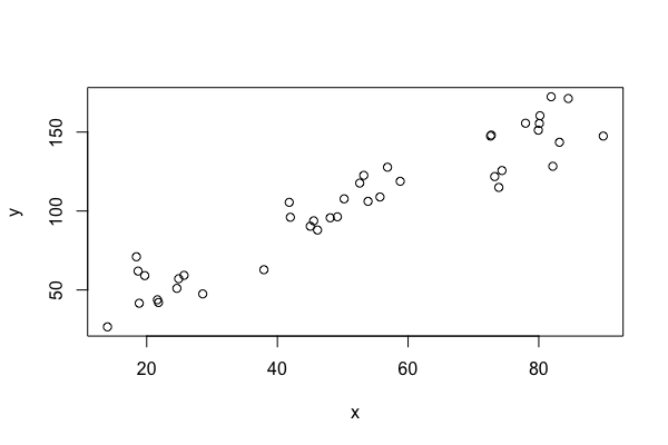
You can then produce a scatterplot of y versus x with
| plot(my.data$x, my.data$y) |
or with
| plot(y~x,data=my.data) |
You can add a title and a subtitle, change the plot symbols, the size or the color of the plot symbol, the axes, number and location of tick marks on the axes, the labelling of the axes, the size and location of the labels of the axes, the font of text, label the points, add a legend, add formulas, and much more. We will only discuss a small selection of the many available options.
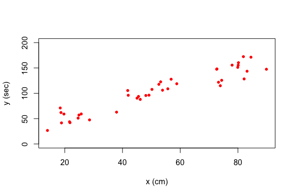
You can change the horizontal range with the option xlim and the vertical range with ylim. You can change the label of the horizontal axis with xlab and the label of the vertical axis with ylab. You can change the plotting symbol with pch and the color with col. Here is an example
| plot(y~x,data=my.data, xlab="space (cm)", ylab="time (sec)", ylim=c(0, 200), pch=20, col='red') |
Suppose that we want to use different colors for different points in our plot. This can be done by specifying a vector of colors. Here is an example. Let's say we want the first five points red, the next five points blue, and the final 30 green. This can be accomplished as follows.
| my.colors <- c(rep("red", 5), rep("blue", 5), rep("green", 30)) |
Here we used the function rep() which replicates the first argument as often as the number in the second argument indicates. With this vector of colors we can create our plot.
| plot(y~x,data=my.data, xlab="space (cm)", ylab="time (sec)", ylim=c(0, 200), pch=20, col=my.colors) |
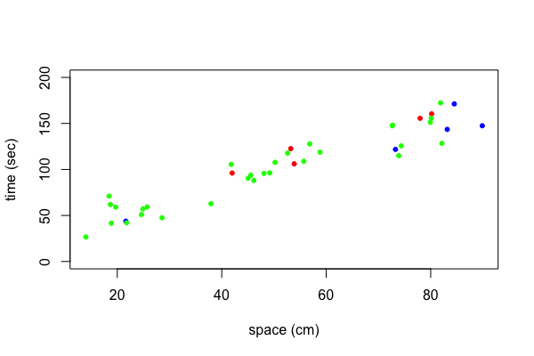
The data my.data contains a variable called type. The variable type is a factor with levels "a", "b", "c", and "d". Lets color points of type "a" red, points of type "b" blue, points of type "c" green, and points of type "d" yellow. To do this we create first a vector where we replace the levels "a", "b", "c", "d" with the numbers 1, 2, 3, 4, respectively.
| type.index <- as.numeric(factor(my.data$type)) |
Now we can create the color vector with
| my.colors <- c("red", "blue", "green", "yellow")[type.index] |
and plot with
| plot(y~x,data=my.data, xlab="space (cm)", ylab="time (sec)", ylim=c(0, 200), pch=20, col=my.colors) |

The same technique can be applied to use different plotting symbols for each type. Suppose we want to plot points of type "a", "b", "c", "d" with the plotting character associated with 0, 2, 4, 5 respectively.
We can create the plotting symbol vector with
| my.symbols <- c(0, 2, 4, 5)[type.index] |
and plot with
| plot(y~x,data=my.data, xlab="space (cm)", ylab="time (sec)", ylim=c(0, 200), pch=my.symbols) |

You might wonder at this point what colors are available. There are colors such as "cornflowerblue" and "peachpuff3". In total, there are names for 657 colors. To see these names use the function colors(). However, you can use any color that your computer can display. There are different ways to describe colors. One popular way is to specify the level of red, green, and blue of a color in the hexadecimal system, e.g., #1B9E77.
Not all of us are good at choosing sensible colors. There are several R packages that can help you with this problem. I highly recommend that you at least take a look at the package RColorBrewer if you need to use different colors in a project.
If you plot with different colors then you need to add a legend that explains what each color represents. In our example we want to indicate the type each color or printing symbol represents. To do this we add a legend to the plot.
| plot(y~x,data=my.data, xlab="space (cm)", ylab="time (sec)", ylim=c(0, 200), pch=20, col=my.colors) |
| legend(x=20, y=190, legend=c("a", "b", "c", "d"), pch=20, col=c("red", "blue", "green", "yellow")) |
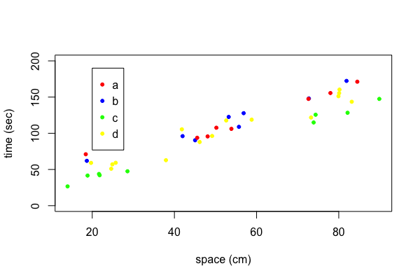
There are many settings to let you adjust the appearance of the legend. I often remove the box around the legend which can be done with the option bty="n".
Suppose you want to add some lines, points, text or other elements to your plot. In this case you cannot use another plot statement because that would just erase what you have done so far. Instead you need to use functions that will add more elements to an existing plot such as lines(), points(), and text().
After you created your plot, you may want to incorporate it into a document such as a web page, your thesis, or some presentation. You can save your plot in a variety of formats in R. This process is especially easy in RStudio. Just go to the Plots menu and select "Save as Image ..." or "Save as PDF ...". You can select various image formats as well as the dimensions of your plot. All this depends on how you are going to use the plot. For a web page I usually choose the PNG or JPEG format but for printed documents I go with EPS or PDF.
You have already seen how to create boxplots in the lesson "Numerical Description of Univariate Data". If your data is provided as in our example data set my.data, then the following approach is more convenient.
| boxplot(y~type, data=my.data) |
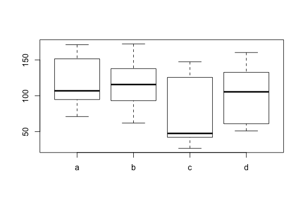
Take a look in the help file to see the many options there are to modify this plot. In the current form, the width of all the boxplots are the same. You could set varwidth=TRUE and then the boxes are drawn with widths proportional to the square-roots of the number of observations in the group.
| boxplot(y~type, data=my.data, varwidth=TRUE) |

Similar to a probability frequency density histogram, a density plot shows us how a variable is distributed. While the histogram is a straightforward representation of the data, the density plot shows the estimated density of a variable. One can compare the distributions of two or more variables by overlaying their density plots.
| attach(my.data) |
| density.a <- density(y[type == "a"]) |
| density.b <- density(y[type == "b"]) |
| density.c <- density(y[type == "c"]) |
| density.d <- density(y[type == "d"]) |
| plot(density.a, ylim=c(0,0.011), main = "Density Plots", xlab = "y (cm)", ylab = "density") |
| lines(density.b, lty=2) |
| lines(density.c, lty=3) |
| lines(density.d, lty=4) |
| legend(x=190, y=0.01, legend=letters[1:4], lty=1:4, bty="n") |
| detach(my.data) |

A simpler way to overlay two or more density functions is to use the function sm.density.compare() from the sm package.