This lesson is about the graphical description of univariate data. For categorical data a brief comparison is made between pie charts and bar graphs. Most of this lesson however is about quantitative data. Frequency, relative frequency, and relative frequency density histograms, and time plots are explained. The shape of a distribution is described using the terms unimodal, bimodal, symmetric, skewed to the left or skewed to the right, and the presence of outliers is indicated.
Statistics is about data. It deals with the collection, analysis, and interpretation of data. In fact, statistics could be described as the science of extracting information from data.
The word data is the Latin plural of the word datum (something given
) and is often used as a singular noun in informal language and as a plural noun in scientific publications. My preference is to use it as a plural noun.
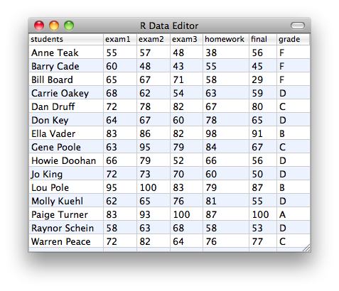
For this course you may picture data as a spreadsheet.
The spreadsheet contains one or more columns. Each column corresponds to a variable and each row corresponds to an individual (also called a case). In the example above, the data contains 7 variables (name, exam1, exam2, exam3, homework, final, grade) and each row refers to a student.
We distinguish between qualitative and quantitative variables. A qualitative variable, also called a categorical variable, assigns a category while a quantitative variable assigns a number to each individual. In the above example, the variable final
is quantitative while the variable grade
is qualitative (or categorical).
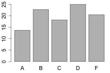
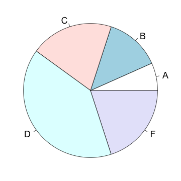
A categorical variable can be summarized by the count, proportion, or percentage of the number of individuals for each category. For example, after an exam you might want to know how the grades were distributed, that is, what percentage of students earned an A, what percentage earned a B, etc.
| grade | A | B | C | D | F |
|---|---|---|---|---|---|
| count | 1 | 2 | 3 | 6 | 3 |
| proportion | 0.067 | 0.133 | 0.200 | 0.400 | 0.200 |
| percent | 6.7 | 13.3 | 20 | 40 | 20 |
This information can be displayed as a pie chart
or a bar graph
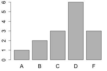
Although the pie chart is one of the most popular graphs, especially in the mass media and the business world, it is not so common in the scientific literature. The reason for this is that the bar chart is usually a better choice since it is easier to compare the lengths of bars than the areas of pie slices.
Click on the slices of the pie chart below in increasing order of size.
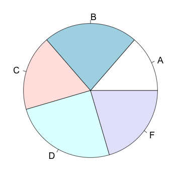
The categories ordered by size are:
However, if the goal is to compare a given category (a slice of the pie) with the total (the whole pie), then the pie chart can be a good choice.
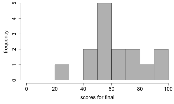
The distribution of values of a quantitative variable is typically illustrated by a histogram. There are three types of histograms: frequency histogram, relative frequency histogram, and relative frequency density histogram.
First I will tell you about the frequency histogram using the final scores as an example. To construct such a histogram we partition a horizontal number line into intervals of equal size (also called bins), so that each value in the data will fall into exactly one of the bins. For our example let's pick the endpoints of the intervals to be 0, 10, 20, ..., 100.
First, we sort the values of the final scores
56, 45, 29, 59, 80, 65, 91, 67, 56, 50, 87, 55, 100, 53, 77
into the appropriate intervals.
What do you think would be the appropriate interval for the value 80?
For this course let's agree to count a case that falls on an endpoint for the left interval, unless it is the smallest specified interval. There is no good reason to prefer one choice over another but I am going with this convention since it is the default setting for the software we are using.
| interval | 20-30 | 30-40 | 40-50 | 50-60 | 60-70 | 70-80 | 80-90 | 90-100 |
|---|---|---|---|---|---|---|---|---|
| sorted data | 29 | 45 50 | 56 59 56 55 53 | 65 67 | 77 80 | 87 | 91 100 |
Next, we count the number of values that fall into each interval.
| interval | 20-30 | 30-40 | 40-50 | 50-60 | 60-70 | 70-80 | 80-90 | 90-100 |
|---|---|---|---|---|---|---|---|---|
| sorted data | 29 | 45 50 | 56 59 56 55 53 | 65 67 | 77 80 | 87 | 91 100 | |
| count | 1 | 0 | 2 | 5 | 2 | 2 | 1 | 2 |
Finally, we draw a rectangle over each interval where the height of that rectangle represents the number (count or frequency) of values that fall into that interval.
By now you might have a couple of questions. How do I choose the width of the intervals? Suppose that I decided upon an interval width, how do I choose a starting point?
Both of these questions are discussed in the literature (see De Beer and Swanepoel 1999; Simonoff and Udina 1997) and there is no simple answer. In practice, however, histograms are produced by software which will make these selections for you according to published recommendations. Be aware that different choices of the interval size and starting point can completely alter the shape of the histogram.
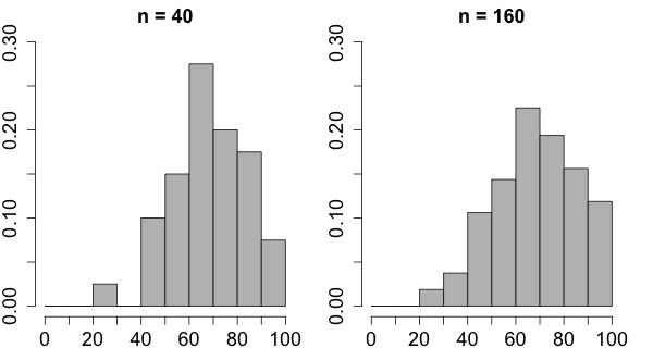
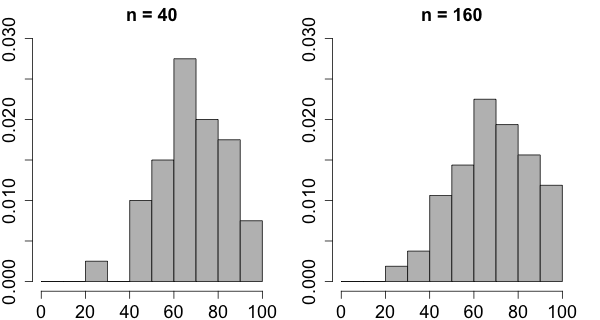
Suppose that the same final exam is given in 2 classes and you want to compare the distribution of the scores in this exam. One class contains 40 students while the other class contains 160 students. For the purpose of comparison you want the interval points to be the same for both classes and in this case it would be reasonable to choose 0, 10, 20, ..., 100 as end points for the intervals.
Let's say that the frequencies for the classes are:
| interval | 20-30 | 30-40 | 40-50 | 50-60 | 60-70 | 70-80 | 80-90 | 90-100 |
|---|---|---|---|---|---|---|---|---|
| n = 40 | 1 | 0 | 4 | 6 | 11 | 8 | 7 | 3 |
| n = 160 | 3 | 6 | 17 | 23 | 36 | 31 | 25 | 19 |
It would be easier to compare the distribution of the scores for the two classes if we used proportions (also called relative frequencies) rather than counts. To obtain the relative frequencies we divide the frequencies by the sum of all the frequencies.
Find the relative frequency of students in the class with 40 students who received between 40 and 50 points.
Find the relative frequency of students in the class with 160 students who received between 60 and 70 points.
A relative frequency histogram is the same as a frequency histogram except that the height now represents the relative frequency rather than the frequency. The relative frequency for an interval is simply the number of values that fall into the interval divided by the total number of observations. In other words, the height of each rectangle represents the proportion of all the values that fall into the interval. The relative frequency histogram has the same shape as a frequency histogram and the only difference between the two is the scale of the vertical axis.
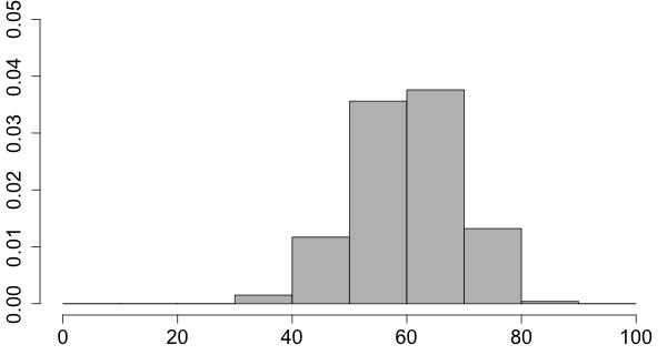
There is one more improvement to be made. Rather than representing a proportion (or relative frequency) by the height of the rectangle, we represent it by the area of the rectangle. In order to obtain the relative frequency density for an interval we divide the relative frequency by the interval length.
In the example above, 8 out of 40 students have a score between 70 and 80. Therefore the frequency of the students in the interval from 70 to 80 is 8, the relative frequency is 8/40 or 0.2, and the relative frequency density is 0.2/10 or 0.02. We divide by 10 because the length of the interval happens to be 10.
If the interval widths are all of the same size then this will only change the scale of the vertical axis. The resulting histogram is called a relative frequency density histogram.
Note that the area of all the rectangles in this kind of histogram is always exactly 1. The proportion of students who scored between 60 and 80 would then be the areas of the rectangles between 60 and 80. For a large number of students one would expect that the height of the rectangle from 60 to 70 would be not much different from the heights of the rectangles 60 to 65 and 65 to 70. In some sense it is like looking at the same shape at different resolutions.
Click on the histogram below to change the interval size.
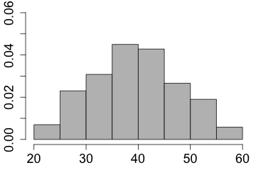
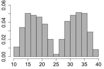
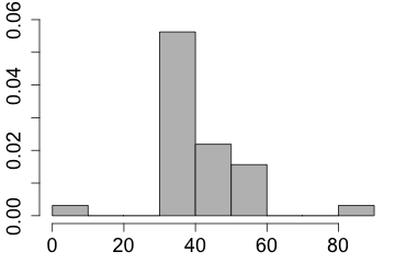
The histogram and the stemplot describe graphically the distribution of the data. The shape of the graph is then described using the following terminology.
| If there is a single peak then the distribution is said to be unimodal | 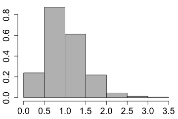 |
| and if there are two peaks then the distribution is called bimodal. | 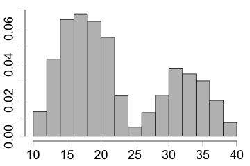 |
| The shape is said to be symmetric if the left half is approximately the mirror image of the right half. |
|
|
| The distribution is skewed to the right if the right tail is more stretched out when compared to the left tail | 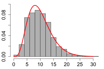
|
| and it is skewed to the left if the left tail is more stretched out when compared to the right tail. | 
|
Observations that do not fit with the overall pattern are called outliers. For now all this means is that measurements that are much smaller or larger than the rest in the data are labeled outliers.
I'll be more specific when I talk about boxplots. The phrase observations that do not fit with the overall pattern
will become clear when I tell you about relationships between 2 quantitative variables.
The last type of plot I want to tell you about is the time plot. In a time plot one plots the values in the order in which the measurements were made and connects the points with straight lines.
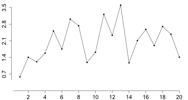
A time plot can be used to see if there is any trend or pattern in the data with respect to the order in which the measurements were made.
Here is how you create the graphs discussed in this lesson. You can copy and paste the code below into the R console. If you type it in then please remember that R is case sensitive.
To create a pie chart we combine either the frequencies or relative frequencies with the function c() and assign them to a variable. Next, attach the category names to that variable. Finally, produce the graph with the function pie(). Using the function barplot() we can create a bar graph.
| x = c(1, 2, 3, 6, 3) | # store frequencies in x |
| names(x) = c("A", "B", "C", "D", "F") | # attach names of categories to x |
| pie(x) | # create pie chart |
| barplot(x) | # create bar graph |
Typically we enter data into R using the function read.csv(). However, if there are just a few numbers then you could enter these values using the combine function c(). Once the data is stored in a variable, the frequency histogram is created with the function hist(). The same function is also used to create a relative frequency density histogram.
A stemplot is meant to be created by hand but we can also do it with R using the function stem(). To create a time plot we use the function plot() where we set the type of the plot to "l" which stands for line.
| y = c(1.1, 3.5, 2.5, 4.6, 2.2, 4.3, 3.7, 4.7, 3.1, 4.1) | # store the data in y |
| hist(y) | # create a frequency histogram |
| hist(y, freq = F) | # create a relative frequency density histogram by setting the frequency option to false |
| stem(y) | # create a stemplot |
| plot(y, type = "l") | # create a plot by connecting the data with lines |