
In this lesson you will learn how to describe the relationship between two quantitative variables for bivariate data. Bivariate data are data where two measurements are made for each individual or case. Here is an example.
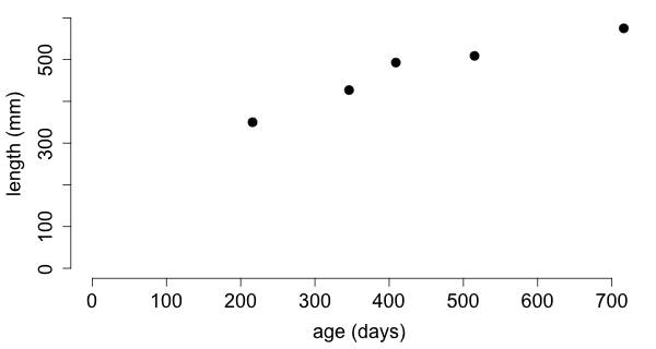
The age and length of a Western Hognose Snake (Heterodon nasicus) is recorded at a few points in time.
| date | age (x) | length (y) |
|---|---|---|
| 2/16/08 | 216 days | 350 mm |
| 5/25/08 | 346 days | 427 mm |
| 8/27/08 | 409 days | 493 mm |
| 12/11/08 | 515 days | 509 mm |
| 5/30/09 | 716 days | 575 mm |
Data provided by Gerda M. Zinner.
What is the relationship between age
and length
?
To describe the relationship between two quantitative variables we first plot the data such that each case corresponds to a single point on the plot whose coordinates are given by the values of these two variables. This is called a scatterplot.
I put the variable age
on the horizontal axis and length
on the vertical axis. Does it matter?
In Mathematics, the horizontal axis is typically called the \(x\)-axis and the vertical axis is called the \(y\)-axis. You may recall that the graph of a function \(f\) consists of all the points \((x, y)\) which satisfy the equation \(y = f(x).\) We are therefore accustomed to think of \(x\) as an independent and \(y\) as a dependent variable. The terms independent
and dependent
are also used in statistics. Also used are the terms explanatory
and response
variable.
It seems reasonable to think of length
as the response variable and of age
as the explanatory variable. In general, there may not be a preferred way to assign the variables to the axes.
After creating a scatterplot of the data, one describes the
of the observed pattern.
In the example there is a strong linear relationship between length
and age.
Furthermore, there is a positive association between these variables.
To say that there is a linear relationship means that the points cluster along a straight line. This phrase describes the form of the scatterplot which could be linear or curved, there could be clusters, or there could be no pattern at all.
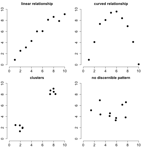
To say that there is a positive association means that an increase in one variable is associated with an increase in the other variable. This phrase describes the direction of the observed pattern in the scatterplot. The variables could have a negative association which means that an increase in one variable is associated with a decrease in the other variable. Also, the pattern might have no direction.

The phrase strong linear relationship
also describes the strength of the observed pattern, although in vague terms. There are different measures that quantify the strength of a positive or negative association.
The most popular measure for quantifying the strength of a linear relationship between two variables is Pearson's correlation coefficient \(r.\) While this measure can be calculated for any quantitative bivariate data, it should only be used when there is a linear relationship between the two variables.
Pearson's correlation coefficient \(r\) measures the strength of a linear relationship between two variables.
It has the following properties:
Pearson's correlation coefficient \(r\) is defined by the formula \[ r = \frac{\sum{(x_i - \bar{x})(y_i-\bar{y})}}{\sqrt{\sum{(x_i - \bar{x})^2} \sum{(y_i-\bar{y})^2}}}, \] where \(x_i\) and \(y_i\) denote the measurements of the \(x\) and \(y\) variable on the \(i\)-th case and \(\bar x\) and \(\bar y\) denote the means of the measurements of \(x\) and \(y,\) respectively.
You should calculate the correlation coefficient with software. In an exam you would be given the value of \(r\) and asked to interpret this value or you would be asked about the properties of \(r.\)
Unfortunately, there is no good, universally accepted interpretation of \(r.\) In this class let's use the following classification. Let's say that the linear relationship is weak if \(|r| \lt 0.5\), moderate if \(0.5\leq |r| \lt 0.8\), and strong if \(0.8\geq |r| .\)
Drag the slider in the graph below and observe how the correlation changes.
The correlation between age
and length
is 0.9634 and so we can say that there is a strong linear relationship between the two variables.
Here are some headlines from the media:
It is a common mistake to interpret a positive or negative association between two variables as one variable promoting or inhibiting the other variable.
Suppose for example, that a study finds that playing violent video games is positively correlated with real-world violence. It might be tempting to conclude that playing violent video games causes violent behavior and therefore the violence in video games should be regulated by law.
Such a conclusion would not be warranted. For all we know, it might be the case that playing violent video games reduces the real-life violence and the positive correlation is explained by another variable that is not accounted for. For instance, a person likely to commit real-life violence might be more likely to play violent video games.
This is all purely hypothetical and my point is only to illustrate that correlation does not mean causation. Whether or not video games do cause violence is controversial. There are hundreds of studies with different conclusions.
Suppose there is bivariate quantitative data stored in the variables \(x\) and \(y\) and we want to plot the variable \(y\) versus the variable \(x.\) This can be done using the function plot(). Here is an example.
| x = c(216, 346, 409, 515, 716) |
| y = c(350, 427, 493, 509, 575) |
| plot(x, y) |
Pearson's correlation coefficient is calculated using the function cor().
| cor(x, y) |