In this lesson you will learn how to describe data with numbers. The two most important summaries of data for a quantitative variable are those for the center and the spread. Appropriate choices for these measures are discussed here as well as the effects of a linear transformation of the data on these measures. This lesson also explains the so called five-number summary and its graphical representation, the boxplot. Finally, the percentile is explained as a measure of relative standing.
In a class of 15 students, the scores of exam 1 are:
55, 60, 65, 68, 72, 64, 83, 63, 66, 72, 95, 62, 83, 58, 72.
How would you describe the center of these numbers?
A typical approach is to describe the center of data by their average. Except that in statistics we use the word mean rather than average. We calculate the sample mean \(\bar{x}\) by the formula \[ \bar{x} = \frac{1}{n}\sum_{i=1}^{n} x_i \] where \(n\) denotes the sample size, here \(n=15\), and \(x_i\) denotes the i-th score.
Another approach for describing the center is to calculate the middle number,
that is, we sort the data and then pick the number in the middle. In statistics, we use the term median instead of middle number.
Below are the data sorted in ascending order. Click on the median:
To find the middle number, we count the number of scores, add 1, and divide by 2. In this example there are 15 scores and therefore the score in the middle, the sample median, is the (15+1)/2 = 8th score.
Suppose for example that there are only \(n=4\) scores. In that case \( (n+1)/2=2.5\), that is, there is no middle number. What do we do when \(n\) is even?
If there is no middle number then we have to average the two middle numbers. So the sample median is the middle number, provided there is one, or the average of the two middle numbers.
Care has to be taken when interpreting a measure of center. Average life expectancy, for example, has substantially increased during the last two decades in the United States. This poses problems for the long term financing of Social Security. Based on this information one might find an increase of minimum retirement age to be the obvious solution.
It turns out, however, that life expectancy has increased much more for wealthy people than for the poor. Should the poor, who depend on Social Security, have to work longer because the wealthy, who don't need it, live longer?
More generally, just because some procedure or decision is best in the
typical
case, does not necessarily make it the best choice in a
particular case.
How spread apart is the data? One idea for measuring the spread of the data is to calculate the average distance from its center. For the data:
55, 58, 60, 62, 63, 64, 65, 66, 68, 72, 72, 72, 83, 83, 95
the center, as measured by the sample mean, is 69.2. So we subtract from each score 69.2 and obtain
-14.2, -11.2, -9.2, -7.2, -6.2, -5.2, -4.2, -3.2, -1.2, 2.8, 2.8, 2.8, 13.8, 13.8, 25.8.
The distances are then the absolute values of these differences, that is, the distances are
14.2, 11.2, 9.2, 7.2, 6.2, 5.2, 4.2, 3.2, 1.2, 2.8, 2.8, 2.8, 13.8, 13.8, 25.8.
The average distance of the data from the mean is therefore the average of these distances, which turns out to be 8.24.
We can describe this measure of spread with the following formula: \[ \frac{1}{n}\sum_{i=1}^{n} |{x_i-\bar{x}}| \] This measure of spread is called the mean absolute deviation.
We will, however, not be using this measure of spread in this course. The one that we are going to use is a bit more complicated. Instead of calculating the average distance, we calculate the sum of the squared distances of the data to the center, divide by \(n-1,\) and then take the square root. This measure is called the sample standard deviation and it is denoted by \(s\). The formula for \(s\) is \[ s=\sqrt{\frac{1}{n-1}\sum_{i=1}^{n} ({x_i-\bar{x}})^2}. \]
In the example above, the squared deviations are
201.64, 125.44, 84.64, 51.84, 38.44, 27.04, 17.64, 10.24, 1.44, 7.84, 7.84, 7.84, 190.44, 190.44, 665.64.
The sum of all these numbers is 1628.4. Dividing this number by \(n-1=14\), we obtain the so called sample variance \(s^2=116.3143\). Finally, taking the square root gives us the sample standard deviation \(s=10.78491\).
Why do we use the more complicated measure of spread, the sample standard deviation, rather than the simpler mean absolute deviation? Also, why do we divide the sum of squares by \(n-1\) rather than by \(n\)?
The question of whether the standard deviation or the mean absolute deviation is the better choice for measuring spread was debated almost 100 years ago (Stephen Gorard, 2005). Ultimately, a mathematical argument made by Ronald Fisher in 1920 decided the debate in favor of standard deviation. He had a list of criteria for comparing the two measures and showed that under ideal conditions the standard deviation was preferable according to one of those criteria. It has been argued that in realistic situations the mean absolute deviation is in fact the better choice. However, since the standard deviation is traditionally used, it is unlikely that it will lose its preferred status anytime soon.
Although many introductory texts to statistics provide some reason for dividing the sum of squares by \(n-1\) rather than by \(n\), it just comes down to convention. It doesn't really matter which definition we adopt as long as we are consistent in the way we use the definition in subsequent formulas.
Another measure of spread is the interquartile range or IQR. To explain this, I first need to tell you what quartiles are. Recall that the median was defined so that half the data are below the median and the other half are above the median.
Exactly half the data? Not necessarily. For 5 numbers, the median is the 3rd number and so 2 of the 5, or 40% of the data are below the median. However, if the number of measurements is large, then about half or 50% of the data are below and about 50% are above the median.
I should clarify what I mean by below the median
and above the median
. Suppose that you have 5 numbers sorted in ascending order, say for example
1, 2, 2, 2, 2.
Then the median is the 3rd number and the first 2 numbers (1, 2) are below the median and the last 2 numbers (2, 2) are above the median. If there are 6 numbers sorted in ascending order then the median is the average of the 3rd and the 4th number and the first 3 numbers are below the median and the last 3 are above the median.
Now lets take the measurements below the median and calculate the median of these measurements. This number is such that about a quarter or 25% of the data lie below it and about three quarters or 75% lie above it. This number is called the first quartile (or lower quartile) and is denoted by \(Q_1\). The median of the data above the median is called the third quartile (or upper quartile) and is denoted by \(Q_3\).
The difference \(Q_3-Q_1\) is called the interquartile range and its abbreviation is IQR. Note that about 50% of all the data has to be in an interval of the length IQR.
There are many other measures of center and spread. This raises some questions.
Should you use the mean or the median to describe the center? Or perhaps some other measure? Which one is the best
choice?
The first thing to realize is that the phrase measure of center
can be misleading. There is no center that we are trying to measure. In fact, the mean and the median can be viewed as different definitions of center.
A measure that is not influenced much by a few observations is called a resistant measure. The mean can change drastically if a single measurement is changed but the median is not influenced much by a drastic change of a few observations. Therefore the median is a resistant measure of center while the mean is not. Similarly, the interquartile range is a resistant measure of spread while the standard deviation is not.
If the distribution of the data is symmetric and mound shaped, then the mean and the standard deviation are typically considered to be the appropriate measures. If outliers are a concern, then the median and the interquartile range are usually a better choice.
Which measure is more appropriate depends on the context; there may not be a single correct answer. And sometimes even an appropriate measure can still be somewhat misleading.
Stephen Gould, an influential evolutionary biologist who taught at Harvard University was diagnosed with abdominal mesothelioma in 1982. At that time this type of cancer was considered incurable with a median mortality of eight months. Given this information one might think that a person diagnosed with this disease has about eight months to live. However, this is not what it means. Although it does mean that half the people diagnosed with this disease will be dead after eight months, it does not say anything about how long those people live who survive the first eight months. In fact, Stephen Gould was so struck by this fact, that he wrote an article with the title "The median is not the message"(Stephen Jay Gould, Discover 6 (June): 40-42, 1985). He lived for another 20 years after his diagnosis of mesothelioma and died of a another unrelated cancer.
What happens to the mean, median, standard deviation, and interquartile range when we change units? Suppose that you measured temperatures in Fahrenheit, but for the publication in a scientific journal you need to convert the measurements into Celsius.
Adding a constant to some data will shift the mean and the median by that constant. It has no effect, however, on the standard deviation or the interquartile range.
Multiplying the data by some constant and then calculating the mean (or median) of the transformed data is the same as calculating the mean (or median) of the data and then multiplying it by the constant.
A similar statement is true for the standard deviation. Multiplying the data by some constant and then calculating the standard deviation (or interquartile range) of the transformed data is the same as calculating the standard deviation (or interquartile range) of the data and then multiplying it by the absolute value of the constant.
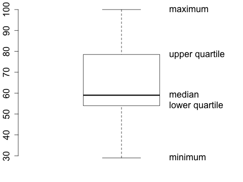
The quartiles divide the range of the data into four intervals. About a quarter of the data is between each of the following intervals: the minimum (min) and the first quartile (\(Q_1\)), the first quartile and the second quartile (\(Q_2\)) (which is the median), the second quartile and the third quartile (\(Q_3\)), and the third quartile and the maximum (max). The five numbers, \(\min\), \(Q_1\), \(Q_2\), \(Q_3\), and \(\max\) are called a five-number summary of the data.
Consider the scores of a final exam in a class of 15 students:
56, 45, 29, 59, 80, 65, 91, 67, 56, 50, 87, 55, 100, 53, 77
The five-number summary of these data is:
29, 53, 59, 80, 100.
Rather than listing these 5 numbers, one usually displays them in a so called boxplot.
The lower edge of the box is at the level of the lower quartile, the upper edge is at the level of the upper quartile and the line in the middle corresponds to the median. The lowest point corresponds to the minimum and the highest to the maximum. This is the basic box plot.
Boxplots are a good way to compare the results of several quantitative variables. Suppose that we want to compare the scores of all the exams in the class.
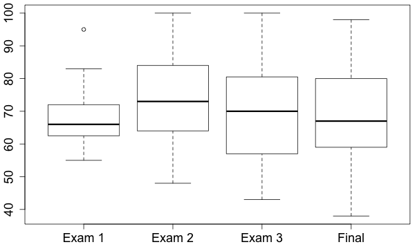
Notice the circle on the boxplot for exam 1. This plot is a modification of the basic boxplot which is used to indicate outliers. Any measurement that is more than \(1.5 \times IQR\) away from the upper or lower quartile is called an outlier and is labeled by a circle or dot. The small horizontal lines in this kind of boxplot are drawn at the levels of the smallest and the largest measurement within the distance of \(1.5 \times IQR\) to the quartiles. There are many other modifications to the basic boxplot being used in the literature.
Below are the scores of exam 1 sorted in ascending order. You already determined the median to be 66 in a previous exercise. Click on the lower and upper quartiles:
55, 58, 60, 62, 63, 64, 65, 66, 68, 72, 72, 72, 83, 83, 95.
The interquartile range is therefore
Next, we multiply IQR by 1.5 and subtract the result from the lower quartile:
Now multiply IQR by 1.5 and add the result to the upper quartile:

The quartiles and the median are special cases of percentiles. The first quartile is the 25th-percentile, the median is the 50th percentile, and the third quartile is the 75th percentile. The 5th percentile for example is a number such that about 5 percent of the data are below that number. The problem is that it is not clear what that means when we have, say, 12 numbers.
Definitions of percentiles are a bit tricky and there are several ways to define them. In fact, the software package R can calculate 9 different types of percentiles. For most purposes it suffices to know that the \(k\)-th percentile, where \(k\) is a number between 0 and 100, is a number \(q\) such that about \(k\) percent are below \(q\) and about \(100-k\) percent are above \(q.\)
The lower quartile in the exercise above, calculated by the recipe that I gave you, was 62. If you calculated the lower quartile using R in the default setting, it would be 62.5.
A percentile is a measure of relative standing. It tells you how a particular value compares to all the other values in the data. Suppose you got a score of 19 in an exam. How are you doing compared to everyone else? If you know that your score is at the 80th-percentile, then you know that you did better than about 80% of your classmates and that about 20% of your classmates did better than you.
For the purpose of illustration we store the scores of exam 1 in the variable exam1
| exam1 = c(55, 60, 65, 68, 72, 64, 83, 63, 66, 72, 95, 62, 83, 58, 72) |
For data that is mound shaped with no outliers the mean and standard deviation are usually good choices for measures of center and spread. These measures are calculated with the functions mean() and sd().
| mean(exam1) |
| sd(exam1) |
If the data is skewed or outliers are a concern then the median and interquartile range are often used for measures of center and spread. The functions median() and IQR() calculate these measures.
| median(exam1) |
| IQR(exam1) |
The five-number-summary is calculated with the function fivenum() and the boxplot, which is a visual representation of the five-number-summary, is created with the function boxplot().
| fivenum(exam1) |
| boxplot(exam1) |
Note that the lower quartile of the data is 62.5 according to the five-number-summary and not 62 as calculated by the recipe given above. The k-th percentile is also called the k/100-th quantile. Quantile and percentiles are calculated using the function quantile(). R has nine different definitions of the quantile function implemented. Use the default when you are asked to calculate a quantile or percentile with R.
| quantile(exam1, p=0.25) | # 25th-percentile or 0.25 quantile |
| quantile(exam1, p=0.25, type=2) | # same as calculated by hand |
Suppose you want to compare the scores in exam 1 with the scores in the final exam using a boxplot. In this case could proceed as follows.
| exam1 = c(55, 60, 65, 68, 72, 64, 83, 63, 66, 72, 95, 62, 83, 58, 72) |
| final = c(56, 45, 29, 59, 80, 65, 91, 67, 56, 50, 87, 55, 100, 53, 77) |
| boxplot(exam1, final) |
Typically, data are provided in a spreadsheet. Suppose you collected body temperature measurements on 100 people, entered them into a spreadsheet, and saved it as a comma delimited text file, say, example.csv. In this case you would first set the working directory of R to the location or folder that contains your data file. Next, you read the data into R using the function read.csv() and store it in a variable. Finally, you create the plot using the function boxplot().
| myData = read.csv('example.csv') |
| boxplot(temperature ~ gender, data = myData) |
The code temperature ~ gender
tells R that the variable temperature contains the measurements and the variable gender contains the categories. R also needs to know which data should be used. This information is provided with the code data = myData.